Consistency, Design, and … what the? Social?
One thing that always gets me super excited when we start talking about design is the whole user experience, and how that website will end up interacting with the end user. Like a tour guide taking you around, design and the user experience that is created can often determine where a user will go next. One design principle that comes up time and time again is consistency. If your brand looks a specific way on your website, it should probably look the same elsewhere too. You were probably wondering when I would tie this into social media, well… right now! Consistency includes social network sites and how your brand appears as a whole. So let’s dive in shall we?
Start with Colors
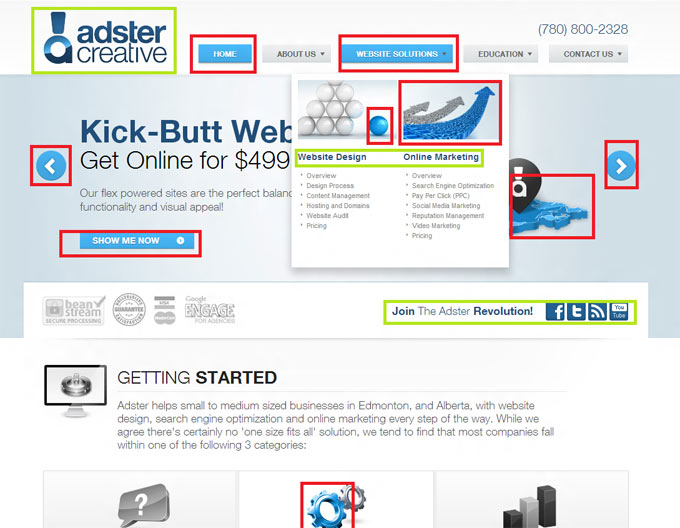
You may not think that color affects that much of what goes on. If you do, it probably more has to do with how your website looks. Colors can convey a lot about your brand and what you do. If your brand tends to be seen as a more upbeat bubbly type personality, bright cheerful colors like yellows and greens will fit nicely. If you are more laid back, yet still fun and excited about what you do, why not use a light blue. For example on the Adster Creative website where blue is very prevalent, the lighter blues (electric outlined by red) are very much action based or current/active indicator, whereas our logo and social connecting links (outlined by green) are a softer gentler blue. It’s a touch more inviting, check it out:
Spice it up with a Sprite (image)
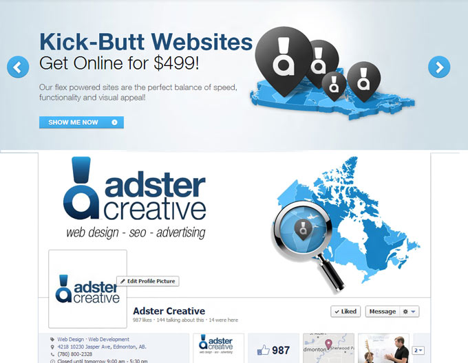
This might seem like a no brainer, but having a banner on your Facebook page, that is completely different than your LinkedIn, or even your website banner is something to watch out for. As in DON”T DO IT! Logo speaks for itself in this case but if you have a completely different style in the type of imagery for every network it doesn’t help for a consistent brand image. How can you know that it’s the same company if things just feel… different? Visual is a huge thing for consistency across the web. And using different pictures for profile page headers or pictures doesn’t help. Take an example from both our website and Facebook page, both having similar colors, weighting, and it seems (in our mind) that this is consistent with Adster’s design everywhere.
Be the King of Personality with… Content. HA!
Man, we just don’t let you forget do we? Ok, so not only does images and colors affect user experience but it’s also how things are presented in words too. Visually, colors and images will be the first thing that catches a person’s attention. Now your job is to keep them there with quality content that accurately describes you as a company. If you’re a business where being professional is the number one concern, than be serious. If you like to have fun with things, try including some things that you enjoy that are specific to your industry such as leaving personal aspirations/pastimes in your about page. And I really do think this is the best place for this to come through, explaining where you came from and especially who your team members are and where they fit in. That individuality makes sure you become a company that can relate to you not only as a client, but as a person. Content is also a big deal for SEO too, so making sure this is up to date, engaging and just flat out fun is truly beneficial. Yup I went there. Content is KING!
Trying to take your brand image to the next level by creating a consistent experience through colors, imagery, and your content is fantastic, but you shouldn’t only make something that looks pretty, you should create a brand identity that people can say “hey that looks like something *insert brand name* would do or make”. A consistent brand image is not only good for looks, it’s good for marketing too. These rules don’t apply just to big corporations either. You as a small business can really take advantage of these things either through your web marketing company, or if you do it yourself awesome. If you don’t know where to start though you can always check out more what we recommend or give us a shout!

